Services
- Brand Audit
- Digital Strategy
- Web Design & Development
Project Overview
During an overall review of Darmody’s communications in 2020 it was felt that, although the majority of its brand assets were on brand and to a high standard, the current website did not reflect the practice’s current position or showcase its extensive experience in a variety of sectors. Our senior Creative Consultant, Nick Cloake had worked with Darmody for over a decade and was responsible for the development of the brand and its implementation, and was tasked with aligning the website with the rest of their communications assets.

New Website
A kick-off meeting with key individuals in Darmody and Idea was arranged to ensure that we could get their views and ambitions for the new website, and allow us to prepare a plan of action, present a comprehensive review of the existing website and outline a project budget.
Websites live or die on the strength of their imagery and we were fortunate that Darmody had an impressive archive of project photography, architectural drawings and illustrations. However, they lacked current and appropriate photography of the staff and images of the team in action. The Practice also needed to agree an overall digital strategy and have the facility to manage both their
Upon reviewing our thoughts and recommendations, Idea was commissioned and asked to proceed at full speed.
Discovery Phase
Internally, Idea set up a project team with Project Manager, Digital Strategist who managed the UX element, two UI Designers and an Account Director. We also encouraged Darmody to set up a small steering committee to manage the project from their end and short circuit the need for large group meetings throughout the project.
An initial ‘discovery’ meeting was held that went into great depth in defining the user-needs of the website, the structure and the content in general. This led to a UX plan and the creation of a number of wire-frames for discussion.
Some time was invested in agreeing the most suitable content management system to ensure that Darmody could easily update and edit the site without damaging the flow and structure.
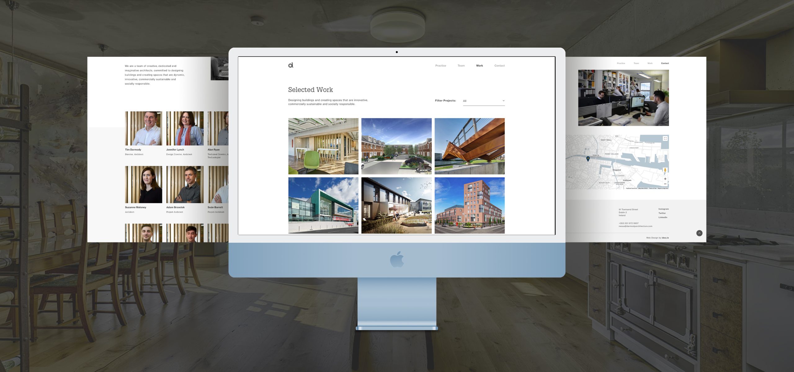
A two-day photoshoot was commissioned to capture a new suite of corporate photography and a full set of portraits for every individual on the Darmody team. In tandem with this a more detailed content plan was developed to identify what content was needed for every page of the site.
Upon approval of the wire-frames and a detailed content plan, the Idea design team took up the challenge of creating a User Interface (UI) that would truly reflect the superb quality of Darmody's output, showcase some of their award winning schemes and populate the site with good corporate and ‘people’ photography.
Mulitple options
Several design options were presented and discussed with the client, who took a particular interest in the design that now exists on the website.
Content Harvesting
The most challenging element of creating a website from the client's point of view is the gathering of content. Idea invested a lot of time in assisting them and actively engaged in both copy creation and quality checking of all photography.
Design and Innovation
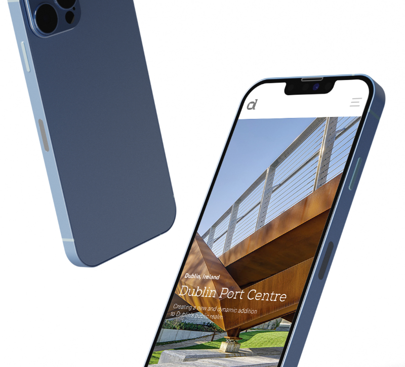
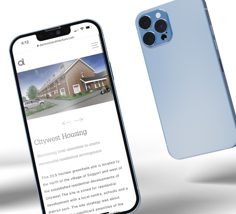
The client was delighted with the new website and they are particularly happy to now have a site that absolutely reflects their position in the architectural sector. The site does not strive to illustrate Darmody as ‘big architecture’ but as a proactive practice that stands out for design and innovation. The website is populated with exquisite project photography that makes the site an enjoyable experience. The site operates smoothly and speedily with some interesting UI features that ensure that this is not simply a standard brochure site, but one that reflects the talents of every part of the idea team that created the site.
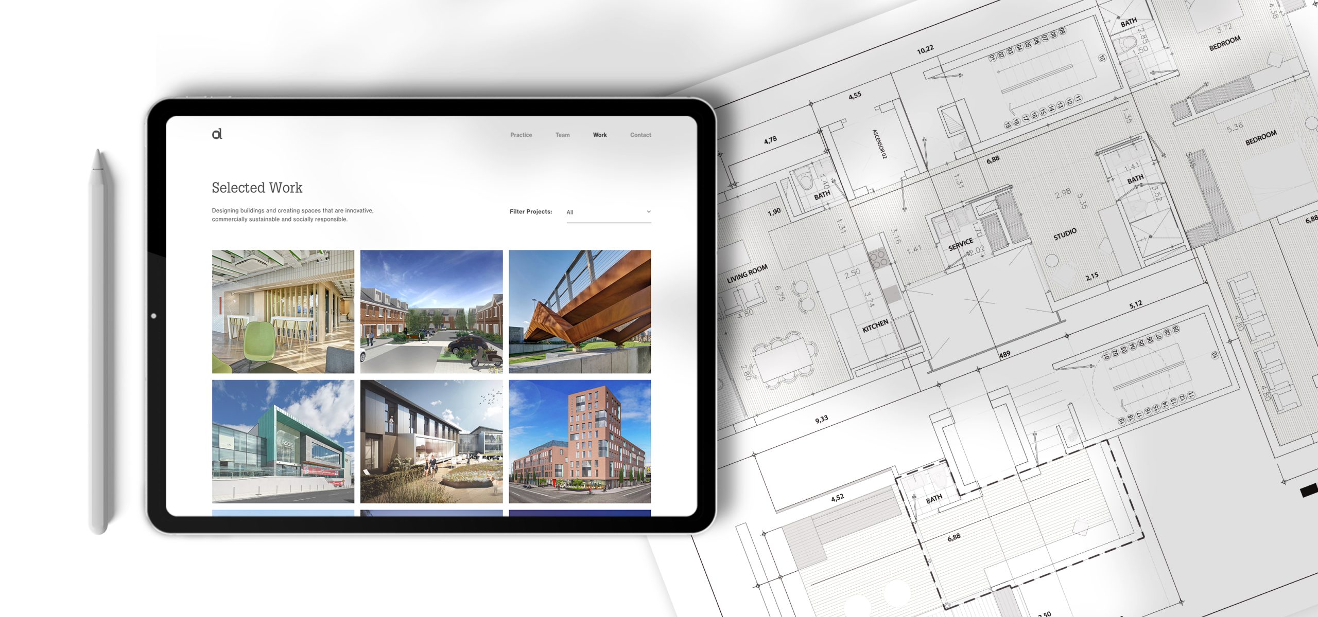
Strong UX And UI at the core of the site
Upon approval of the wire-frames and a detailed content plan, the Idea design team took up the challenge of creating a User Interface (UI) that would truly reflect the superb quality of Darmody's output, showcase some of their award winning schemes and populate the site with good corporate and ‘people’ photography.
Several design options were presented and discussed with the client, who took a particular interest in the design that now exists on the website.
The most challenging element of creating a website from the client's point of view is the gathering of content. Idea invested a lot of time in assisting them and actively engaged in both copy creation and quality checking of all photography.
With all our contents in hand the design team, with the project manager and digital strategist, managed the movement of the site to the development phase - operating a quality control check throughout this phase

