Services
- Branding & Logo Design
- Digital Strategy
- Web Design & Development
- Presentation
Project Overview
Attestor approached Idea to develop their brand and digital presence. We kick started the project with a creative workshop with both their UK and Irish teams to establish their values and clarify their goals. Our challenge was to translate all of this into their brand story and communicate it across their identity, website, presentations and marketing collateral.

Branding & Logo Design
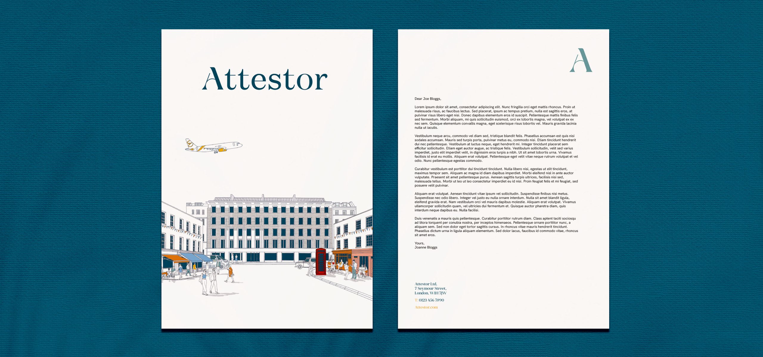
Trust, partnership and integrity are key to everything Attestor do. The brand we were to create needed to convey the positive, human, understated nature of how they work. Simplicity and brevity are at the core of everything they do. With this in mind we wanted to create a bespoke, brandmark, uncomplicated, straightforward and approachable, whilst still being confident and trustworthy.
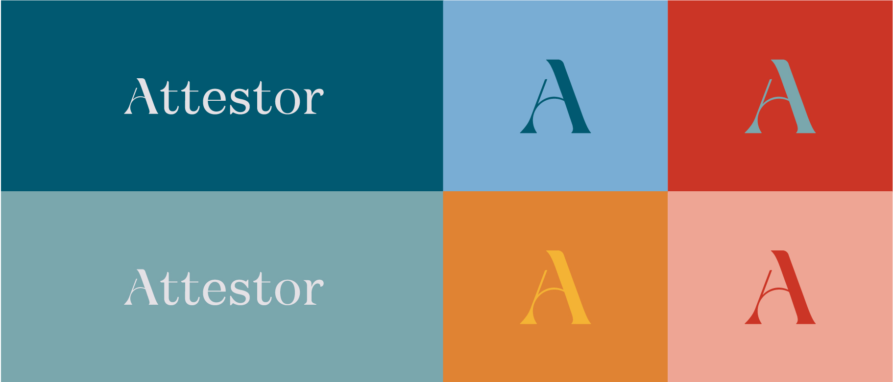
We developed a unique logotype, sophisticated and understated at first glance, but on closer inspection, attentive to the details. We started with a classic Didone style typeface which we personalised and made unique to Attestor, which gives an overall sense of subtle luxury.
We developed a unique logotype, sophisticated and understated at first glance, but on closer inspection, attentive to the details. We started with a classic Didone style typeface which we personalised and made unique to Attestor, which gives an overall sense of subtle luxury.
Balancing the font
The chosen type style contained some sharp edges, which we balanced by bringing elements of roundness and softness to the individual characters, evoking Attestor’s diligence and rigour when it comes to their work, but also calling to their brand values of being approachable and human. This not only reflects the methodology of the firm, but brings to mind their unparalleled attitude in the field of investment.
Their unique A ‘ascends’ and stands out above the rest.
Their unique A ‘ascends’ and stands out above the rest.

Curvature of letters
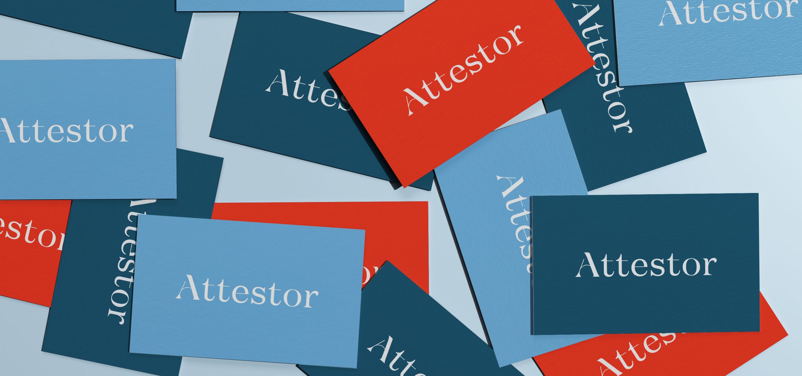
We carefully crafted each curve, space and line of each letter of the brand to ensure that the letters worked together cohesively to create the brand identity that reflected their true values.
Dynamic Colour Palette
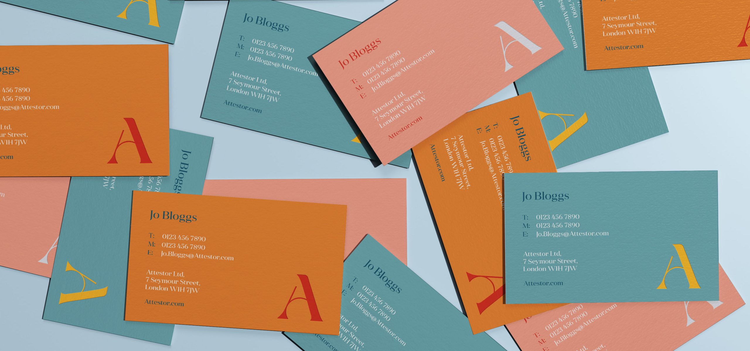
Through collaboration with the client, the final colour palette that was organically reached through our workshop process. This ensured that Attestor had a brand that truly reflected the company they had become.

Digital Presence
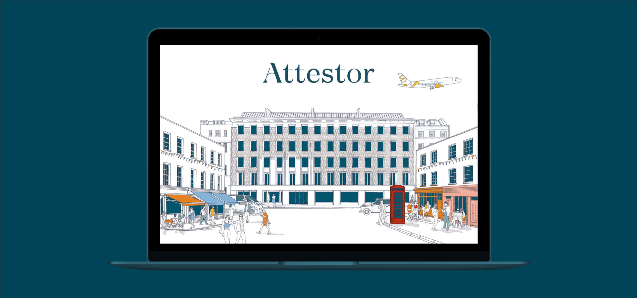
We took to telling their story online, in a very simple visual and interactive way, with a one-page scrolling website. Once the narrative was developed, we storyboarded and worked with illustrator, Jitesh Patel to bring the concept to life as an illustration. Once the style and visual direction were approved we then set to work on activating this in a dynamic way adding interactions and animations to the site, creating an engaging website that was not only strikingly simple, but unique to Attestor.
Check it out at Attestor.com
Check it out at Attestor.com
What the client had to say
Idea took the time to understand us and created a brand and web presence that captures us perfectly. Such a great job on all fronts!
Susannah McAleese,
Partner, Attestor
Partner, Attestor

